4 Ways to Optimize the Post-Click Experience

Decades ago, when your advertisement converted well, it added dollars to your bottom line. If people called your phone number or mailed in a check after seeing your print ad, it was to purchase your product.
That’s no longer the case.
Today, on the internet, an ad can have a click-through rate of 100%, but not earn your business a cent of revenue. Yet, the advertisement is still treated as THE most important element of the advertising campaign, even though it’s not what gets users to buy, sign up, download, or call anymore.
Now, what drives action is load times, landing pages, and everything that happens after an ad is clicked. Online, that’s known as the post-click experience.
The pre-click vs. the post-click experience
Before the internet, there was only the ad and the conversion. But the click has changed all that. Online, prospects take action by clicking an ad, and then they take action again by choosing to claim or not claim an offer.
Therefore, we can divide the user experience into two parts as it relates to a marketing campaign. Everything before the click, and everything after:
- The pre-click experience: The user experience before the click. Affecting the pre-click experience are things like where your ad is shown, how it’s presented, its colors, headlines, value proposition, etc.
- The post-click experience: This is everything after the click. Affecting the post-click experience are things like visual hierarchy, conversion ratio, retargeting, and message match.
Like a headline is only good if it gets people to read the copy, an ad is only good if it gets people to click and visit the landing page. And a landing page is only effective if it gets visitors to convert.
Advertisers are familiar with a lot of the things that make a good pre-click experience, but elements affecting the post-click experience may seem a little more foreign. And you can’t fix what you don’t know is broken…
4 elements every advertiser should know for post-click optimization
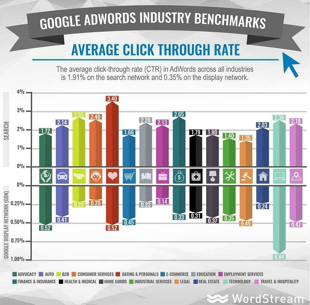
It’s an unfortunate truth that most ad dollars are wasted. The average Google AdWords click-through rate is only 3.17% across all industries, and on the display network it’s an embarrassing 0.63%:
That means, on average, out of every 100 people who see your ad, 96-99 of them are not clicking it. And what’s worse — when they DO click it, only between 0.77% and 3.75% of them convert.
To boost that conversion rate, here are a few elements every advertiser should know to optimize the post-click experience:
Message match
Publishing an ad is like making a promise. It says to the viewers, “here’s what we have to offer.” The last part of the promise is fulfilled when they claim your offer and determine if it was as advertised.
But before they even get there, the landing page has to fulfill the promise of the ad by letting visitors know they’re in the right place.
That can be accomplished with a headline, colors, and images that are identical to the advertisement. Your visitors won’t bother to evaluate your copy or even glance at your form if they think you’ve pulled the old bait and switch trick with your ad and landing page.
Here’s a great example of message match from WordStream. Here’s the ad:

And the corresponding landing page:

No navigation
On your website, navigation links help visitors move between pages to learn more about you. On your landing page, though, they’re holes that let visitors escape. And those holes are killing your conversion rate.
You should think as every link outside of your call-to-action button as a distraction, and you should eliminate as many as possible. The ideal conversion ratio (ratio of links to conversion goals) on a landing page is 1:1. Terms of service and privacy policies can be tucked into the footer, but they shouldn’t distract the visitors from the CTA button. Here’s an example from Adobe:

Visual hierarchy
Theories of attention state that we don’t perceive everything equally. It was proposed in Germany over 100 years ago by three psychologists who concluded that “the whole is other than the sum of its parts.” As in, when you’re crossing the street, you don’t notice birds flying overhead because you’re focused on getting to the opposite curb safely. In that scenario, cars are more important to attend to than birds, because cars directly threaten your well-being.
In most everyday situations when our safety isn’t at risk, there are certain cues that jerk our attention around. Things that are bigger, higher, move faster, contrast their surroundings — these are a few of those visual cues.
On your landing page, you can use this theory to guide visitors to your most important elements. Here’s how:
- Higher = more important than things that are lower. Your headline should be higher than your body copy. Your body copy should be higher than your form. Before they can convert, they have to know why.
- Bold, italics = more important than letters which aren’t bold or italicized. These should be things like your headline, benefits, or words like “free,” “limited-time offer” or “while supplies last…”
- High contrast = more important than things with low contrast. When you’re creating your landing page, you have to be mindful of the colors you’re using because the most important elements have to stand out on your page. The 60-30-10 rule is great to follow in this instance. It says 60% of your page should be your base, then 30% should be your background, and 10% should be your accent. That accent should be things like your logo, your CTA button, and maybe your form. Your visitors shouldn’t have to hunt to find out where to convert.
- White space = things with more space around them are important enough to own their own section of a page. This is a great way to draw attention to badges and testimonials, and your CTA button in particular. Your button shouldn’t be surrounded by clutter. It should be all alone, easy to find.
- Bulleted = more important than things which aren’t bulleted. Bullets are best used when listing benefits.
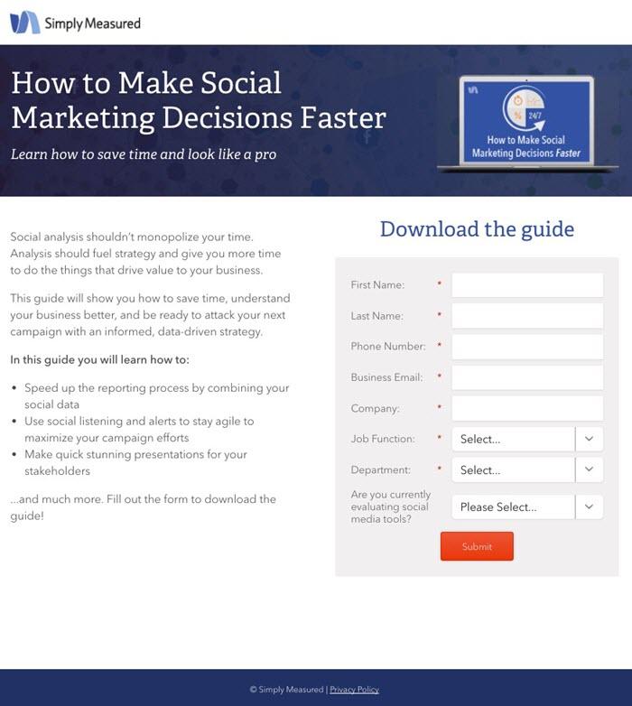
Research has shown that both on and off the internet, people skim when they’re not pleasure reading. Using these cues to guide their eyes instead of letting them skim block text can be effective in getting them to evaluate your offer completely.
Here’s an example from Simply Measured that guides the visitor to the CTA button logically and effectively:
Good “thank you” page
It’s easy to treat the “thank you” page as an afterthought. You’ve already got their email address, their credit card number — so who cares what’s on the next page, right?
Wrong.
The “thank you” page is probably the most underrated and underused landing page type there is.
To your new leads, the “thank you” page can be viewed as a test — how you’re going to treat them once they’re a customer. Are you truly grateful to have their business? Are you going to treat them like they’re more than the contents of their wallet?
When a “thank you” page is a big blank page that simply says “thank you” on it, you’ve failed the test. Your new lead thinks, “they got what they want.” And now they’re a little more skeptical when your emails show up in their inbox. Here’s what a good “thank you” page does:
- First, it shows sincere gratitude — as it should. These new leads, customers, are the reason your business is growing. It’s nothing without them, so act like it by making sure your “thank you” is unique, personal, grateful, and complimentary as you can.
- Second, it should let new leads know how when and where they’ll get their new resource. Will it come in their inbox later today? Will it download to their computer immediately? They should know so there’s no confusion, and they should also be given a way to contact you in case the asset never gets there.
- Lastly, it should offer additional, relevant content. If your lead just downloaded a book on email marketing tactics, the “thank you” page should direct them to more resources on email marketing. And a great way to find out where your visitor is in the marketing funnel is to offer them different types of content. Offer a tip sheet on subject lines and a case study on how one business used your tool to grow their subscriber list by 100,000. They may be closer to purchase than you think.
Most “thank you” pages leave much to be desired. But that’s good news for you, because creating a great one is an easy way to stand out.
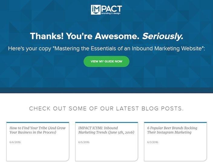
Here’s an example of a “thank you” page that nails all three points, from IMPACT Branding & Design:
Post-click optimization is a win-win
Today, most sales aren’t made with ads. They’re made with landing pages. And optimizing the post-click experience is a win-win:
Your visitors get what they were promised, you get them as a customer, and your business grows as a result.
About the author
Ted Vrountas is a freelance writer at Instapage who hates most marketing content. As a human among marketers, his goal is to write words people actually want to read.
Meet The Author
Guest Author
WordStream’s guest authors are experts, entrepreneurs, and passionate writers in the online marketing community who bring diverse perspectives to our blog on a wide range of topics.
See other posts by Guest Author
More Articles Like This


Comments
Please read our Comment Policy before commenting.

Sign up for our weekly newsletter!
Related Articles
